

You're probably staring at a workbook, a project plan, and a building spec that all say roughly the same thing in different ways. Access control depends on cabling. CCTV depends on power and network coverage. Electrical certification depends on installation sequencing. Someone from facilities wants a clear go-live path, while IT needs to know what fails over when a comms cabinet drops.
That's where Flow Chart Excel still earns its keep.
Not because Excel is a brilliant diagramming platform. It isn't. It works because most IT and facilities teams already have it open, understand how to share it, and can turn a messy infrastructure brief into something people can follow. For unmanned building projects especially, a workable Excel flowchart often beats a perfect diagram trapped inside a specialist tool that only two people can edit.
Visualising Your Unmanned Building Project in Excel
An unmanned building project sounds straightforward until you try to define what “unmanned” means on site. In practice, unmanned building management in the UK means creating a cohesive ecosystem where automated access control via digital keys or fobs with real-time remote permission revocation, AI-powered CCTV monitoring for unusual activity without 24/7 guard oversight, and remote utilities and environment management for HVAC, lighting, and power operate without on-site staff, forming a fully autonomous building unit, as outlined in this overview of unmanned building management.
That single definition already tells you why a visual planning tool matters. You're not deploying one system. You're coordinating access, surveillance, power, data, remote control, and response logic across different contractors and internal teams.

Why Excel still works on live infrastructure projects
Excel is rarely the best drawing tool. It is often the best coordination tool.
On office fit-outs and autonomous site upgrades, the flowchart usually starts as a simple operational question. What happens when a user presents a credential at a door? That expands quickly into switch ports, PoE allocation, controller location, fail secure versus fail safe behaviour, camera coverage, internet resilience, and the handover path for support. That's why teams often pair a process flow with wider thinking around ethernet and wireless design, rather than treating the diagram as a standalone picture.
What the flowchart actually gives your team
A good Excel flowchart does three jobs at once:
- It exposes dependencies. You can see whether the access control installer is waiting on electrical first fix, structured cabling, or cabinet readiness.
- It creates a shared language. Network engineers, facilities managers, and commercial electrical installation teams can all point at the same step.
- It surfaces operational gaps early. If nobody has mapped “door online but WAN offline”, that problem usually appears later at the worst possible time.
Practical rule: If a building is meant to operate without on-site staff, every box in the flowchart should answer one question. Who acts, what powers it, and what happens if it stops responding?
That's why Flow Chart Excel is useful here. It turns a technical stack into a sequence people can review, challenge, and sign off before the first fix is closed up behind plasterboard.
Shapes vs SmartArt Which Is Right for Technical Diagrams
Excel gives you two realistic routes for a flowchart. You can build it manually with Shapes, or use SmartArt for a faster visual layout. For technical infrastructure work, they are not equal.
Microsoft Excel has never included a dedicated, auto-generated Flow Chart button. Creating flowcharts requires manually inserting shapes from the Illustrations > Shapes menu, a process unchanged since Excel 2007, which is why it remains distinct from tools such as Visio, as noted by Acuity Training's guide to creating a flowchart in Excel.
Why Shapes usually win
SmartArt is fine for a board slide or a simple approval process. It's weak once your diagram has branch logic, side paths, ownership lanes, or infrastructure notes that don't fit a template.
For technical diagrams, manual Shapes give you control over:
- Connector routing that follows the underlying logic of a system
- Swimlanes for IT, facilities, electrical, and security responsibilities
- Custom spacing when certain stages need more detail than others
- Mixed notation such as process steps, decisions, documents, and exception paths on one sheet
SmartArt tends to force neatness at the expense of accuracy. In infrastructure planning, that's the wrong trade.
Flowchart Tool Comparison: Shapes vs. SmartArt for IT Projects
| Feature | Shapes (Manual) | SmartArt (Automated) |
|---|---|---|
| Layout control | Full control of placement, spacing, and branching | Limited to preset layouts |
| Decision paths | Easy to build complex yes or no routes | Awkward once branches multiply |
| Swimlanes | Practical to create manually | Not well suited |
| Technical annotations | Flexible for notes, labels, and references | Constrained by template structure |
| Speed for simple diagrams | Slower to start | Faster to start |
| Suitability for infrastructure work | Strong | Best only for simple process visuals |
When SmartArt still helps
There are cases where SmartArt is still worth using. If you need a quick internal summary of project phases such as survey, install, test, certify, handover, it can be enough. It's also useful if the audience only needs the broad sequence and won't rely on the diagram for installation detail.
Use SmartArt when the diagram is there to communicate. Use Shapes when the diagram has to survive design changes, contractor reviews, and handover.
For real projects involving CCTV, access control logic, and commercial electrical installation sequencing, Shapes are usually the safer choice. They take longer, but they don't box you into a template that breaks as soon as the project gets real.
Building Your Diagram Grids Shapes and Connections
Start with the worksheet, not the shapes. Most messy Excel flowcharts don't go wrong because the author picked the wrong rectangle. They go wrong because the page wasn't set up as a usable drawing surface.

For precise diagrams in UK infrastructure projects, setting column width to 1.71 (17 pixels) and row height to 0.5 cm in Page Layout view creates a square grid, reducing shape misalignment errors by approximately 40% compared to default settings, according to this Excel flowchart grid method.
Set the grid before you draw anything
That square grid matters more than people think. If you build in Normal view and start dragging shapes freehand, alignment drifts. It might still look acceptable on your screen, but it becomes painful once another person edits it or you need to insert extra steps.
Use this basic setup:
- Switch to Page Layout view.
- Set columns to 1.71.
- Set rows to 0.5 cm.
- Turn on grid awareness and place shapes against the cells, not against guesswork.
If your workflow includes powered devices at the edge, controller uplinks, or camera drops, it also helps to keep the drawing aligned with the wider cabling logic. That's especially true when the process map sits alongside Power over Ethernet cabling considerations, because the workflow often mirrors actual physical dependencies.
Use the right symbols for the job
A technical process chart doesn't need every symbol in the Excel library. It needs the right few, used consistently.
- Terminator for the start or end of a sequence. Example: “Project approved” or “Building handed over”.
- Process rectangle for actions. Example: “Install controller”, “Test CCTV field of view”, “Issue electrical certificate”.
- Decision diamond for branch points. Example: “Mains available?” or “Door online after commissioning?”
- Document shape when a deliverable matters. Example: “Certification pack issued”.
Here's a practical sequence for a commercial electrical installation and certification workflow in an unmanned building unit:
- Start with site survey approved
- Run first fix electrical
- Install containment and structured cabling
- Fit access control hardware and CCTV devices
- Test power and network connectivity
- Decision: System passes commissioning?
- If yes, issue handover documents and certification
- If no, return to fault rectification
Connectors are not decoration
Often, Flow Chart Excel work falls apart when people draw plain lines instead of connectors. Plain lines look fine until you move a shape. Then the diagram becomes a repair job.
Use connector lines that attach to the shapes themselves. If a process box shifts, the line should move with it. That sounds minor. On live projects with multiple revisions, it saves a lot of wasted time.
A connector should describe dependency, not just direction. If one step cannot happen without another, your line needs to make that relationship obvious.
This walkthrough is useful if you want to see one approach in action:
A simple layout that holds up in review
For infrastructure diagrams, a left-to-right or top-to-bottom pattern usually works best. Keep exception paths to one side. Put supporting notes outside the main route. If your electrical contractor, security installer, and IT lead all need the chart, make the main line easy to follow in under a minute.
A clean sheet beats a clever one. If a reviewer has to ask which line belongs to which system, the diagram is already costing you time.
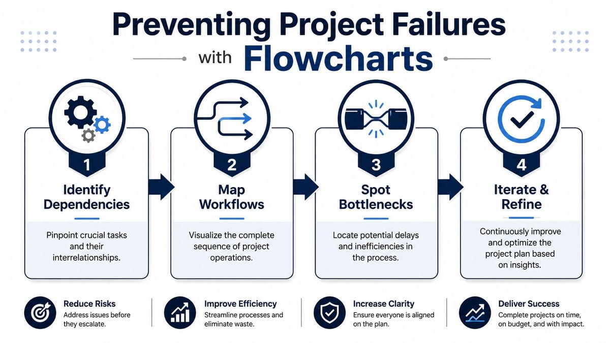
Using Flowcharts to Avoid Common Project Failures
Most unmanned building projects don't fail because the lock, camera, or switch was inherently wrong. They fail because one team planned access, another planned power, and a third planned data, with nobody forcing those decisions into a single operating model.
That's what the flowchart is for. Not the ideal journey. The failure journey.
Design access, power, and data together
A door reader that authenticates perfectly is useless if the controller loses power. A camera with clean coverage is limited if the network path behind it hasn't been planned for remote access, recording, and alerting. An autonomous building only works when these systems are designed as one stack.
That's why a useful project flowchart asks operational questions such as:
- If mains power is lost, what remains live
- If WAN connectivity drops, which functions continue locally
- If a credential is revoked remotely, how quickly does that reach the edge device
- If CCTV flags unusual activity, who gets notified and through which path
When teams need a broader planning discipline around dependencies and sequencing, this guide for complex build project management is a helpful companion to the flowcharting work itself.
Why many unmanned projects fail in practice
The recurring problems are usually operational, not theoretical.
One team assumes another team is handling resilience. A lock specification gets chosen without thinking through local power dependency. CCTV is installed before final sightline review. Certification paperwork is treated as an end-stage admin task instead of something shaped by installation decisions from day one.
Battery-less, NFC proximity locks often come up in this conversation for sensible reasons. They can simplify maintenance because there are no lock batteries to manage across a building estate. They also remove one recurring point of operational failure. That doesn't make them right for every door or every security policy, but they're often attractive where simplicity, reduced routine maintenance, and controlled access revocation matter.
If the flowchart only shows the happy path, it isn't a project control document. It's a presentation slide.
Build failure branches into the diagram
A practical Excel flowchart for an unmanned site should include decision points around power loss, failed commissioning, offline devices, and handover blockers. It should also feed into the project's own review cycle and post-project record. Teams that capture these points properly usually create better lessons learned documentation, because the failure logic was visible from the start rather than reconstructed later.
One of the most useful habits is to ask this after every decision diamond: if the answer is no, who owns recovery?
That single question catches a surprising amount of bad planning before it reaches site.
Advanced Techniques for Professional Project Diagrams
A rough flowchart is enough for your own notes. It isn't enough for a handover pack, a contractor review, or a project board that needs to approve a live migration path.
The difference usually comes down to a handful of disciplined techniques.
Label decision paths properly
A common expert-level pitfall is omitting Yes/No labels on decision diamonds, which increases process interpretation errors by 55%, according to this guidance on creating a flowchart in Excel.
That sounds obvious until you review a chart with three branches leaving the same diamond. If the path labels aren't explicit, different teams read the same diagram differently. On an unmanned building project, that can mean one contractor assumes a failover path exists while another reads the same line as a manual intervention step.
Add small text boxes near the outgoing connectors. Keep them close enough to remove doubt.
Group the diagram before you share it
The same source notes that failing to group all objects results in accidental misalignment during 68% of edits, and grouping reduces those layout disruptions by 81% in practice through the standard Group action in Excel.
That matters because Excel flowcharts rarely stay still. Someone adds a compliance stage. Someone inserts another test point. Someone moves a cabinet from one riser plan to another and the workflow shifts with it. If the chart isn't grouped, tiny edits turn into layout repair.
A simple routine helps:
- Select everything once the structure is stable
- Group shapes and connectors
- Save a working version before major revisions
- Only then circulate it for comments
Use swimlanes to assign ownership
Swimlanes are one of the biggest reasons to choose manual Shapes over a more automated layout. They let you split the chart into responsibility bands such as IT, Facilities, Security, and Electrical Contractor.
That helps in three practical ways:
| Use of swimlane | Why it matters |
|---|---|
| Installation ownership | Stops tasks falling between contractors |
| Review clarity | Each team can trace only the steps they own |
| Handover readiness | Makes support boundaries clearer after go-live |
For unmanned building systems, swimlanes are especially useful when CCTV, commercial electrical installation, and access control all intersect. You can show where one team finishes and another takes over, instead of burying the handoff inside a long list of tasks.
Keep visual hierarchy boring. Consistent shape sizes, restrained colours, and obvious labels beat decorative styling every time.
Add hyperlinks when the workbook needs depth
One useful upgrade is to turn the flowchart into a workbook navigation layer. A process box for “Cabling certification” can link to the certification tab. “Wi-Fi validation” can jump to survey results. “Door schedule” can open the relevant worksheet.
That approach works well when the chart becomes the front door to a project file rather than just an illustration. It's particularly helpful for fit-outs where reviewers need the visual process and the supporting detail side by side.
Know when Excel stops being the right tool
Excel is strong enough for many project diagrams. It stops being comfortable when the chart becomes too large, needs formal version control beyond workbook habits, or requires specialist diagram features.
If you need heavily data-linked diagrams, richer diagram governance, or far more complex layouts, move up to a dedicated platform such as Visio or Diagrams.net. The point isn't to force everything through Excel. The point is to use Excel where its accessibility beats its limitations.
From Plan to a Fully Autonomous Building
A good Excel flowchart does more than document a process. It helps teams build out fully autonomous unmanned building units with fewer assumptions hidden between disciplines. When access logic, CCTV response, power resilience, installation sequencing, and commercial electrical installation and certification all sit in one visual plan, the project gets easier to review and harder to misunderstand.
That matters because autonomy in buildings isn't just about technology selection. It's about operational continuity. A site only behaves as unmanned when access control, surveillance, connectivity, and environmental management keep working together under normal conditions and under fault conditions.
The value of Flow Chart Excel sits right there. It gives IT managers and facilities leads a practical planning layer that can be collaboratively edited, reviewed, and used during delivery. It won't replace specialist design software. It doesn't need to. Its job is to turn a scattered specification into a coordinated build path that installers, reviewers, and support teams can all follow.
If the diagram is well built, site work becomes more predictable. Handover becomes cleaner. Maintenance planning improves because failure points were mapped before go-live, not discovered after the fact.
And when the project includes CCTV, remote power management, access control, structured cabling, and compliance sign-off, having a delivery partner that can turn the diagram into a working system makes the final difference between a clever plan and a reliable building.
If you're planning an office fit-out, relocation, or autonomous building upgrade and need help turning that design into a secure, certified deployment, Constructive-IT can support the full path from planning and infrastructure design through installation, testing, and handover.